
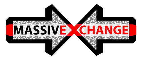
 Hey mx peeps. Here's some shit I whipped up the last few days. Watchyall
think? Freshy Freshington? Or Baron VonGrundelsniff?
There's a lot of directions (pun?) I could take this is, but it's already possibly too busy, so I could get down with some feedback. I'd also be happy to post the Illystr8t0r file for anyone who wants to remix it, but we don't have any file storage yet, do we? Can I upload files to pbwiki?
The ornamentation came from BriarPress.org, in the "Cuts and Caps" section. Basically it's a good sized collection of meticulously vectorized letterpress imagery, and most of it is free (that which does cost $ is very reasonable, or so I hear, and is only for the really complex stuff. Worth it).
Thursday, July 26, 2007
logo idea!
Subscribe to:
Post Comments (Atom)
4 comments:
make the X transparent, showing some filigree. So it's like the arrows are these two big space freighters of swirly inspiration juice and they're docking and mixing that shit up.
unG!!! lovin it, kabuki-cheeky-red-dot-flare on the edges, nice touch.
i wanna see a version on a black background with white outlines. we can use it to replace the massive exchange text at the top of the blog
yeah, totally subconscious tokyo plastic influence there, methinks.
I like it, I'd kind of dig a different shape as opposed to the white rectangle, maybe like an owl face cropped or something, >oo<
shitty, but just my 2 cents...
Post a Comment